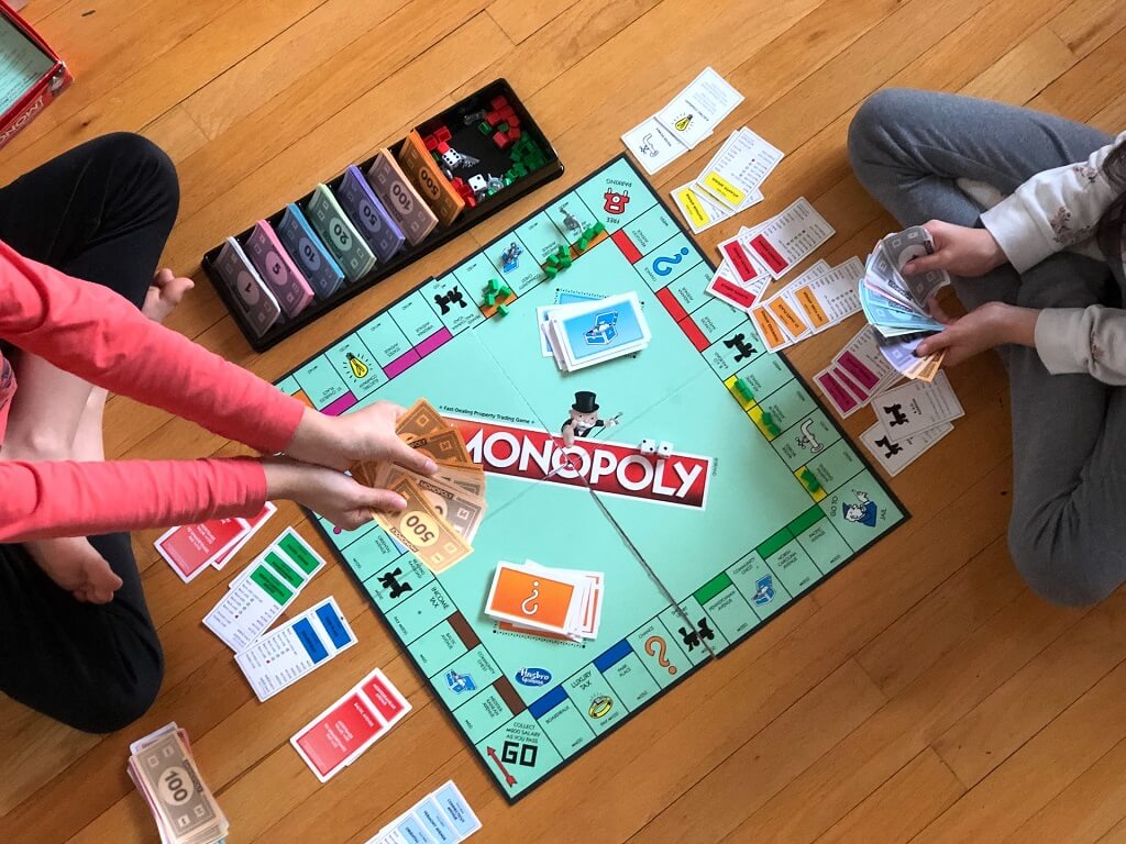
Board game design artwork is not just decoration, it’s a crucial part of the player experience. A well-designed board game is immersive, intuitive, and visually compelling.
However, many game creators encounter unexpected issues when it comes to artwork, particularly during the production process.
Whether you’re an indie developer, publisher, or manufacturer, understanding and avoiding board game artwork problems can save time, money, and headaches.
Table of Contents
1. Low Resolution and Blurry Images
One of the most frequent issues is receiving artwork files that are too low in resolution. This results in blurry prints, pixelated images, and poor visual quality when scaled to size, especially for large components like game boards and box covers.
Cause:
Designers often use web-quality images (72 dpi) instead of print-quality images (300 dpi or higher). Additionally, images might be copied from online sources or scaled up beyond their original dimensions.
Solution:
- Always design artwork at 300 DPI or higher.
- Ensure that every visual element (icons, illustrations, backgrounds) is created or exported in high resolution.
- Use vector graphics for logos, icons, and illustrations when possible, as they scale infinitely without any distortion or quality loss.
2. Incorrect File Formats
Using the wrong file format can disrupt the printing process, leading to color shifts, transparency issues, or missing layers.
Cause:
Some file formats (like JPEG or PNG) may flatten layers or discard important color and transparency data. Others may not be compatible with prepress systems used by manufacturers.
Solution:
- Submit files in print-ready formats such as PDF, AI, or PSD, depending on your manufacturer’s preference.
- Preserve layered files (e.g., PSD or AI) during the design stage for future edits.
- Always ask your manufacturer for file format guidelines.
3. Improper Bleed and Safe Zones
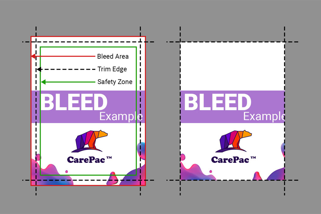
Key design elements get cut off or appear too close to the edge during printing.
Cause:
Designs that lack sufficient bleed and safe zones don’t account for minor misalignments during cutting and die-cutting.
Solution:
- Use a minimum bleed of 3mm (1/8 inch) around all edges.
- Keep all important text and icons within the safe zone, typically 3–5mm inside the cut line.
- Follow the manufacturer’s die line template carefully.
4. Color Mismatch (RGB vs CMYK)
Colors look vibrant on screen but appear dull or inaccurate when printed.
Cause:
Designers often work in RGB color mode, which is optimized for digital screens. However, printers use CMYK ink, which can’t reproduce the full RGB spectrum.
Solution:
- Design in CMYK mode from the start, or convert your files to CMYK before exporting.
- Use Pantone Matching System (PMS) colors for precise brand consistency.
- Request a printed proof or color swatch from the manufacturer to verify accuracy.
More details about the color modes, please check this article – Which Color Mode Is Better for Printing Your Game: CMYK, Pantone or RGB?
5. Missing or Misaligned Die-Cut Lines
Game components (cards, tokens, boards) don’t align correctly after cutting or punching.
Cause:
Designs don’t follow the exact dimensions or alignment of the die-cut template provided by the manufacturer.
Solution:
- Always use the official die-cut template provided.
- Place artwork on separate layers from the cut lines.
- Include registration marks and dielines in a non-printing layer for reference.
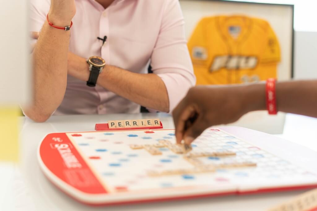
6. Unreadable Fonts and Text Size
Important information is hard to read due to overly stylized fonts or small text sizes.
Cause:
Designers sometimes choose decorative fonts that may look appealing but lack legibility, especially at small sizes or when printed on textured materials.
Solution:
- Use clear, legible fonts for rules, stats, and game instructions.
- Maintain a minimum font size of 6–8pt depending on the component size.
- Avoid placing light-colored text on light backgrounds, or dark text on similarly dark backgrounds, for readability.
7. Inconsistent Art Style
Artwork across cards, boards, and other elements feels visually disjointed, leading to a poor player experience.
Cause:
Multiple artists may be involved without a shared visual direction, or stock images may be mixed with custom illustrations.
Solution:
- Establish a style guide early in the design process.
- Use one or a few consistent illustrators and asset creators.
- Maintain uniformity in character design, color palette, and visual themes.
8. Legal and Licensing Issues
Artwork uses copyrighted or trademarked images without permission, leading to legal risks and production halts.
Cause:
Some creators unknowingly use images found online or mimic styles of famous brands (e.g., using Pokémon images in a fan-made game).
Solution:
- Only use artwork you own, license, or commission.
- Avoid fan art or copyrighted content without permission.
- Work with artists who can provide signed licensing agreements for commercial use.
Final Thoughts
Artwork problems are the most common and preventable issues during board game development. By understanding these pitfalls and collaborating closely with designers, artists, and manufacturers, you can ensure your game looks just as amazing on the table as it does in your imagination.
If you’re working with a custom board game manufacturer, always request their artwork guidelines early in the process and ask for feedback before final submission.