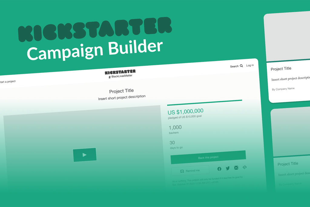
Launching a game on Kickstarter is more than just having a great game — it’s about telling your story visually, building excitement, and gaining trust from backers. Your project page layout plays a crucial role in converting curious visitors into enthusiastic supporters.
Table of Contents
Why Does The Page Layout Matter?
Your Kickstarter page is your storefront, your pitch, your trust-builder and your story all in one. As one guide on The City of Games puts it: “Your Kickstarter page is all on one long page … you need to break it up to stop visitors from feeling lost and to avoid the feeling of endlessness as they scroll.”
Key reasons why layout matters:
- First impressions: The hero image, the intro block, and the clarity of “what is this game?” message matter a lot.
- Flow: A visitor needs to be guided step by step — what the game is, why it’s worth backing, what they’re getting, what the risks are, etc.
- Visual & readability: Large blocks of text without visual breaks turn people off; good layout uses images, section headings, and gives breathing space.
- Trust: Your page isn’t just about “buy this game” — for backers, it’s “will this creator deliver?” Layout helps you present the team, timelines, budgets, and risks.
Because your board game manufacturing background gives you component knowledge and production credibility, you’re in a good position — now let’s ensure the page reflects that.
1. Pre-layout Preparation
Before you open the Kickstarter editor and drop in sections, do this groundwork:
Define Your Ideal Audience & Message
Know who will back your game (casual gamers, hobby gamers, families, educators?). Then craft your key message: what makes your game distinctive, why someone should care, and what emotionally/visually will hook them.
Prepare Your Assets
- Hero image / primary image (see next section).
- Video (2-3 minutes ideally) that introduces the game, shows play, and shows your team.
- High-quality component photographs/renders (board, cards, tokens) sized for the web. Use images ~1360px wide because Kickstarter’s compression makes smaller images blurrier.
- Clear text blocks and section headings (e.g., “What’s in the box”, “How to play”, “Stretch goals”, “Rewards”).
- Timeline, risk/mitigation section, shipping/fulfilment details (especially important for board games).
- Prelaunch feedback: consider sharing page draft or wire-frame with your community or play-testers to catch clarity issues.
Think Sequencing
There’s more than one “correct” sequence, but you’ll want a logical flow. For example: Intro → Visual overview → What you get → How it plays → Rewards & pledges → Stretch goals → Team & timeline → Risks & FAQs → Shipping. A good article sets out a recommended sequence of sections.
2. The Hero & Intro Block
This is the top of your page — what someone sees immediately (including across social shares, Kickstarter’s category listings, mobile view). It must stop scrolling and invite people to dive deeper.
Hero Image
- Use a strong, eye-catching image of the game setup (board + components in use) rather than a plain box shot.
- Avoid heavy text overlays, badges, banners. Kickstarter specifically recommends avoid images with banners, badges, or text, since they may be penalised in visibility.
- Check technical spec: image should be at least 1024 × 576 px (16:9 ratio) and plan for mobile vs desktop display.
Intro Copy
Right below/alongside the hero image you want a concise, clear description. A recommended intro section includes:
- Player count, age rating, play time.
- Elevator pitch (1–3 sentences to summarise the game).
- Visual (photo or render).
- 1-2 paragraphs describing theme + core mechanics.
- A “wow” image/artwork.
By doing this, you give immediate clarity: what is this game? Why does it matter? Many backers skim — this is your chance to retain them.
3. “What’s in The Box” / Components Section
After the intro, your visitor should clearly see what they’re buying. Board game backers like to visually inspect the components, see the value, and understand what they will receive.
Layout Considerations
- Use a grid or visual gallery of component photos/renders: board, cards, tokens, packaging, inserts.
- Accompany each image with short captions: e.g., “12″ × 12″ game board”, “150 custom illustrated cards”, etc.
- For bundle/expansion offers, clarify which components are included in each reward tier.
- Use consistent image sizes and spacing so it doesn’t feel chaotic.
Why This Matters
Backers need to judge value: “Does $X for this game make sense?” Showing components gives transparency. It also builds excitement — nice artwork + good materials = “premium feel”. Many failed campaigns lack this clarity and lose trust.
4. About The Game / How to play
Here we move from “what you get” into “what you experience”.
About The Game (Mechanics & Theme)
- Explain the theme: setting, player roles, goals.
- Then mechanics: e.g., worker placement, deck building, bidding, set collection.
- Highlight what makes your game unique or fun. Use bullet points or short paragraphs.
- Supplement with images of gameplay in action (people playing, game end-state).
- Make sure the message aligns with your target audience (casual gamers vs hobbyists).
How to Play
- Embed or link to a short “how to play” video (not just a promo — ideally a demo of real gameplay).
- Provide a downloadable PDF of the rulebook or quick start guide if possible. This transparency builds confidence.
- Use step-by-step visuals or GIFs to explain turns, or use call-out boxes (“Your turn: draw two cards”, “Then resolve actions”, etc).
- Be clear—but not overly dense. Remember many visitors will skim.
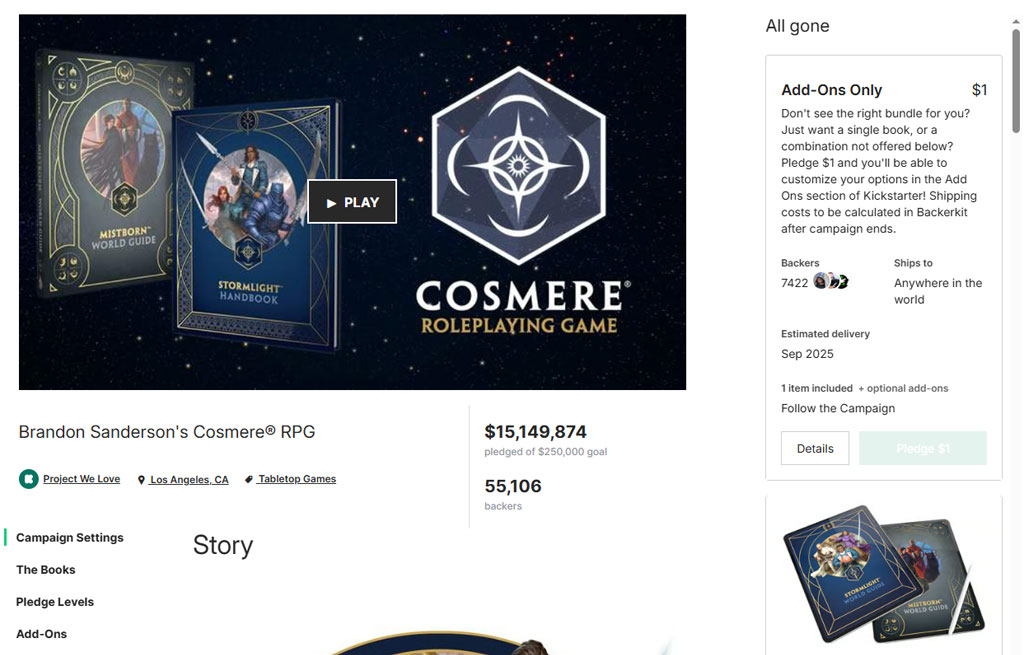
5. Rewards / Pledge Levels
Once readers understand the game and mechanics, it’s time to show them how to back it.
Layout Tips
- Present a table or visual card-style layout of pledge tiers: name, price, what’s included, estimated delivery.
- Clearly highlight “core pledge” tier (you might visually emphasise it) and note early-bird or super-early-bird specials if you use them.
- For add-ons or expansions: show these in a separate section or a subsection, with visual icons and pricing.
- If you have group pledges / retail packs: include them clearly, maybe in a sidebar or below main tiers.
Best Practices
- Use simple naming (e.g., “Base Game”, “Deluxe Edition”, “Collector’s Edition”) — avoid jargon that backers might not understand at a glance.
- Make sure shipping/delivery info is included close to pledge tiers (or a clear link to shipping section) so people aren’t surprised later.
- Be honest about what’s included and when the rewards will ship — avoid vague “we’ll surprise you later” promises.
6. Stretch Goals, Add-ons & Extras
Stretch goals and extras are important for scaling a campaign, but they must be handled cleanly in layout so as not to confuse or clutter.
Structure
- Create a distinct section titled “Stretch Goals” (if applicable). Explain: “These will unlock once the funding passes X, X+Y, etc.” Include visuals/icons for each goal (e.g., upgraded component, new faction, mini-expansion).
- Create “Add-ons” section (optional) for items backers can tack on after pledge (e.g., extra copies, accessories, promo packs).
- Clearly mark what is part of the base game vs what is unlocked or extra. This clarity avoids backer complaints.
- Ensure the layout doesn’t overly distract from the core pledge tiers — so use collapsible sections or clear headings, so backers don’t feel overwhelmed.
7. Team, Timeline & Production Plan
This is the credibility-building section. Layout matters because you want to reassure backers: “Yes, they know what they’re doing”.
Components
- Team bios with photos (designer, publisher, illustrator, lead manufacturer etc). Keep each bio brief (2-3 sentences) and highlight relevant credentials.
- Production timeline: Visual timeline graphic is best (prototype → design finalised → manufacturing quote → production → shipping).
- Manufacturing/quality statement: Especially for board games, mention your factory partner, component quality, QC process, help them trust you.
- Risks & challenges: Transparent discussion of what might go wrong and how you plan to mitigate. This goes at the end, but still part of this credibility section.
Layout Tips
- Use a horizontal timeline graphic (or vertical) for visual impact.
- Use icons or images for each team member (photo + name + role).
- Use bullet lists for risks & mitigation. Make sure it looks like you’ve thought about it — don’t hide risks in tiny text.
- Provide links to previous projects (if you’ve done campaigns before) or testimonials.
8. Shipping, Taxes & Fulfilment
Board game campaigns often fail or create negativity because of hidden shipping/tax surprises. You want this section clearly visible and laid out cleanly.
What to Include
- Regions covered (e.g., US, Canada, EU, Australia).
- Approximate shipping cost (or at least “shipping cost to be collected after campaign via pledge manager”).
- Estimated delivery month/year.
- Whether taxes (VAT/GST) are included or collected later (backer needs to know).
- Mention fulfilment partner or process if known.
Layout Style
- Use a table: Region | Estimated Shipping | Tax Info | Delivery Date
- Use a “small print” style or collapsible FAQ for extra details.
- Use icons for world map, truck, boxes – to add visual appeal.
- Place this section toward the end but before Call-to-Action. It should be accessible – many backers will scroll to verify this.
9. FAQ, Media & Call-to-Action (CTA)
As the visitor gets near the end of your page, you want to summarise and prompt them to act.
FAQ
- Use a two-column layout or toggled sections: question on left, answer on right.
- Cover questions like: “Is this prototype final?”, “Are expansions included?”, “When will shipping happen?”, “What if we hit fewer backers?”, “What’s your refund policy?”.
- Keep each answer short and to the point.
Media / Press
- Include a section “In the Media” or “Previewers” if you have quotes or video playthroughs.
- Use logos of board-game press or websites that have previewed your game.
- Use a short video embedded (if you didn’t already) or link to a play-through/review.
Call-to-Action
- At the bottom (and maybe also pinned somewhere mid-page), place a clear CTA: e.g., “Back this project” or “Select your pledge level →”.
- Use a visual reminder of the hero image, tagline, and pledge button.
- You might include a simple “5 seconds why you should back this” box: a bullet list of key selling points.
10. Mobile & Scrolling Considerations
Many backers will view your page on mobile devices. Layout must be mobile-friendly.
- Use large font sizes for headings and readable body text.
- Ensure images scale and are high-resolution (1360px width recommended) so they look crisp on mobile.
- Ensure that each section is clearly separated (with spacing/background shading) so mobile viewers don’t get lost in one long wall of text.
- Avoid extremely wide horizontal layouts — stick to vertically stacking sections.
- Preview your page on mobile before launch to ensure readability, link behaviour, images load properly.
11. Testing & Pre-launch Iteration
You should not design your page and rush into launching. Some essential best practices:
- Create a draft page early and share it with your community or play-testers for feedback (“Does it make sense?”, “Can I tell what this game is?”, “Do I feel trust?”).
- Test readability on different devices (desktop, tablet, mobile).
- Review triggering of Kickstarter algorithm: the early traffic/backing matters. But good layout helps retain that traffic.
- Look at similar successful board game Kickstarter pages and observe their layout, visuals, flow.
12. Summary Checklist (Layout-Focused)
Before you hit “Launch”, go through this layout checklist:
- Hero image (16:9, no heavy text overlay, catches attention)
- Intro block with elevator pitch + key stats (play length, players, age)
- “What’s in the box” visuals with component details
- Game mechanics/theme explanation with supporting imagery
- How to play section (video, quick rules, visuals)
- Rewards/pledge tiers clearly laid out (prices + what you get)
- Stretch goals/add-ons section (if used) clearly distinguished
- Team + timeline + production section (credibility build)
- Shipping/taxes/fulfilment table or summary
- FAQ/media section
- Final CTA and summary of key selling points
- Mobile readability check
- Enough visual breaks, section headings, consistent font/image style
- Feedback gathered from peers/testers
- Realistic tone (no over-promising) and transparency in risks.