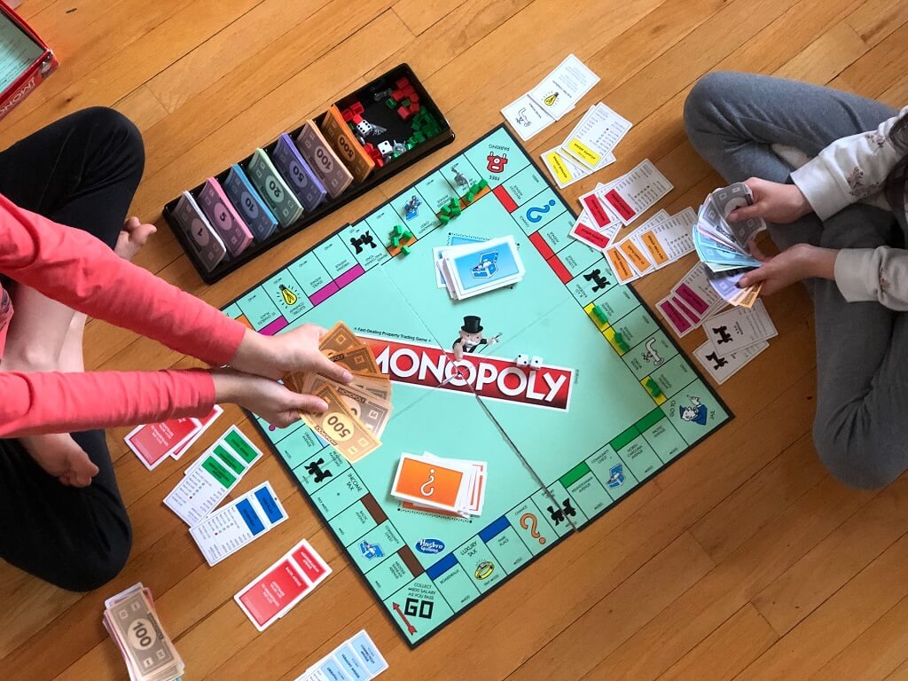
In trading card games (TCGs), visual design plays a crucial role in helping players understand the game at a glance.
Among all graphic elements, icons for abilities and stats are some of the most important – they act as quick, intuitive cues that convey complex information without the need for long text descriptions. A well-crafted icon set enhances readability, immersion, and game flow.
In this article, we’ll explore how to design professional-quality icon sets for TCGs, from concept to execution, covering design principles, style consistency, color strategy, testing, and implementation.
Table of Contents
Understanding the Role of Icons in TCGs
Before diving into design, it’s vital to understand what icons represent in a trading card game and how players interact with them.
Icons are visual shorthand for in-game information. In TCGs, they are commonly used to represent:
- Stats: Health, attack power, defense, mana, energy, speed, or rarity.
- Abilities: Special powers, elemental types, buffs, debuffs, or effects.
- Resources: Gold, crystals, action points, or turns.
- Status effects: Poisoned, frozen, burned, shielded, etc.
Because players constantly refer to icons during gameplay, they need to be:
- Instantly recognizable
- Consistent in style and scale
- Clear at small sizes
- Thematically appropriate to the world of the game
Think of icons as the language of your game’s mechanics – once players learn their meanings, they can read the board effortlessly.
Step 1: Define Your Game’s Visual Language
Every TCG has a theme: fantasy, sci-fi, cyberpunk, mythology, or steampunk – and your icons should reflect that atmosphere. Before sketching anything, define your visual language.
Ask yourself:
- What is the setting and tone of my game? (e.g., mystical vs. mechanical)
- Should icons be flat and minimal or detailed and textured?
- What materials or symbols fit the world? (e.g., crystals, swords, circuits)
For instance:
- A fantasy TCG might use gem-like mana symbols, shield icons, or ancient runes.
- A sci-fi TCG could use glowing energy nodes, plasma swords, and holographic effects.
Create a mood board with references from games, movies, and art styles that fit your theme. This will guide your color palette, line work, and shape language throughout the icon set.
Step 2: Plan Your Icon Categories
Organize your icon set into logical categories before starting to draw. This ensures visual consistency and helps streamline future updates.
Typical icon categories include:
| Category | Examples | Notes |
|---|---|---|
| Primary Stats | Attack, Defense, Health, Speed | Use clear geometric forms |
| Resources | Mana, Gold, Crystals, Energy | Should be distinct from combat stats |
| Status Effects | Poison, Freeze, Burn, Shield | Use dynamic shapes or motion cues |
| Ability Types | Magic, Melee, Range, Healing | Can use thematic symbols (swords, staffs, hearts) |
| Elements or Factions | Fire, Water, Earth, Air | Often tied to color schemes or unique frames |
Planning ahead avoids confusion later – it’s much easier to design a cohesive set when you know exactly how many icons you’ll need.
Step 3: Start with Simple Sketches
Once you have your categories, begin by sketching each icon in black and white. Avoid colors at this stage; focus purely on shapes and readability.
Here are a few design principles to follow:
- Simplicity over detail: Icons should remain clear even at 16×16 pixels.
- Use universal symbols: For example, a sword for attack, a heart for health, and a shield for defense.
- Avoid unnecessary outlines: Thick outlines may clutter small icons.
- Balance symmetry and motion: Static icons (like health or mana) can be symmetrical, while active abilities (like attack) benefit from dynamic angles or movement.
Create multiple versions of each concept. Test how recognizable they are by shrinking them down – if you can’t tell what the icon represents at 1 cm wide, it needs simplification.
Step 4: Choose the Right Style
Your icon style should blend seamlessly with your card art and overall game design. Common icon styles in TCGs include:
- Flat Design: Clean, minimalist, easy to print and scale. Works well for digital and tabletop formats.
- Outlined Icons: Bold shapes with outlines, great for clarity on busy backgrounds.
- Gradient or 3D Icons: Adds depth and realism, suitable for fantasy or digital TCGs.
- Textured Icons: Integrates hand-drawn or painterly effects for an organic feel.
Consistency is key – use the same stroke width, corner radius, and shadow depth across all icons. Create a style guide that defines:
- Line thickness (e.g., 2px strokes)
- Icon padding and spacing
- Color codes and gradient angles
- Shadow or glow parameters
This makes it easy to maintain uniformity, especially if multiple artists are working on the project.
Step 5: Select an Effective Color Palette
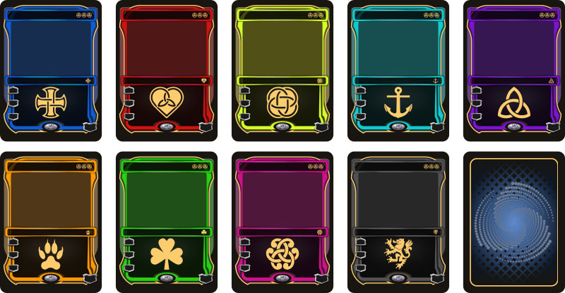
Color adds clarity and emotion to your icon set. Each hue should communicate a clear meaning.
Here’s a classic approach:
- Red: Attack, fire, aggression, danger
- Blue: Magic, water, wisdom, mana
- Green: Nature, healing, growth
- Yellow/Gold: Energy, light, coins
- Purple: Poison, shadow, mystery
- Gray: Defense, armor, neutrality
Stick to a limited color palette (5-8 base colors) and use brightness and saturation variations for contrast.
Step 6: Digital Rendering and Refinement
Once sketches and color codes are finalized, create the digital versions using design software such as:
- Adobe Illustrator or Affinity Designer (for vector icons)
- Figma (for scalable UI icons)
- Procreate or Photoshop (for hand-painted or textured icons)
Work in vector format whenever possible – it allows you to scale icons for both print and digital formats without losing quality.
After creating the first batch, test them in context:
- Place icons on sample card templates
- Adjust stroke thickness for readability
- Check contrast against card backgrounds
Make sure icons look equally clear on light and dark backgrounds, as some card types or factions may use different color schemes.
Step 7: Test with Players
Before finalizing your icon set, conduct playtesting and feedback sessions. Show your icons to people unfamiliar with your game and ask:
- Can you tell what each icon represents?
- Which icons look too similar?
- Are there any that are confusing or hard to read?
You’ll often find that what looks obvious to you as a designer may not be intuitive to players. Refine based on this feedback, focusing on readability and distinctiveness.
Step 8: Export and Implementation
When your icons are approved, export them in various formats and sizes for different uses:
- SVG: Best for digital interfaces and vector scaling
- PNG (512px, 256px, 64px): Common for game prototypes and printing
- Icon sheets (sprite maps): Useful for game engines like Unity or Godot
Also, document the final usage rules:
- Minimum display size
- Do’s and don’ts (e.g., don’t stretch or recolor without approval)
- Background or border rules for specific icons
This ensures long-term consistency as your TCG expands or transitions into digital versions.
Bonus Tips for Professional Results
- Create variations: Add elemental versions or rarity effects later (e.g., glowing borders or animated highlights).
- Design for scalability: Keep details simple enough to look good on both print cards and mobile screens.
- Add motion cues in digital games: Slight animations like glowing, pulsing, or spinning can enhance recognition.
- Use icon fonts or style libraries: Helps developers integrate icons easily during UI implementation.