Color is one of the fastest, most powerful signals a board game designer can use: it directs attention, communicates state, separates teams, and adds emotional tone.
But color is not universal.
A non-trivial portion of players see color differently — and if your design relies solely on color to convey rules, choices, or game state, you may unintentionally exclude them.
This guide explains why colorblind-friendly design matters, what to do about it, and how to build games that are more inclusive, playable, and ultimately more successful.
Table of Contents
1. How Common Is Color Vision Deficiency?
Color vision deficiency (CVD) — commonly called “color blindness” — is not rare.
- Roughly 8% of people with a Y chromosome (about 1 in 12 men) have a common form of CVD.
- About 0.5% of people with XX chromosomes (women) are affected.
- That means in many gaming groups, there’s a good chance that at least one player has difficulty distinguishing certain colors.
The most common types are red–green deficiencies (protanopia/protanomaly and deuteranopia/deuteranomaly). Less common are blue–yellow deficiencies (tritanopia) and total color blindness (very rare).
Practically, the largest impact for most games comes from players who can’t reliably tell reds from greens or have reduced sensitivity. If your components or icons rely solely on red vs. green to indicate “good vs. bad”, many players will be confused or disadvantaged.
2. Why Accessibility Equals Better Games?
Designing for colorblind players is not just moral — it’s smart.
- Wider market: Inclusive components mean more people can buy and enjoy your game. That’s more sales and more positive word-of-mouth.
- Better UX for everyone: Redundant signals (shape + color, texture + color) clarify information under many conditions: poor lighting, quick game play, small components, or distracted players.
- Fewer customer complaints & returns: Players will praise your thoughtful design — and you’ll avoid angry messages and negative reviews from frustrated customers.
- Stronger communities: Players who feel welcome are more likely to teach the game, create content, and recruit others.
- Competitive advantage: Not many small publishers systematically design for CVD — you can stand out.
3. Where Color Dependency Usually Causes Problems?
Know the common failure modes so you can audit your design:
- Action choices that are only color-coded (e.g., “If you choose the red ability…”).
- Token sets where players must sort or identify identical-shape tokens by color.
- Player boards that use color to indicate resources, phases, or status.
- Cards or tiles that use color to show suit/type without additional markings.
- Dice pips or counters whose meaning depends on color alone.
- Map overlays/territories colored to show control or affiliation without patterns or icons.
- Rulebook examples that assume colors are obvious (e.g., “red player moves first”) rather than using names or symbols.
4. How to Make Your Board Games Colorblind-friendly?
Principle A — Always Use Redundant Cues
Use more than one visual channel to convey the same information.
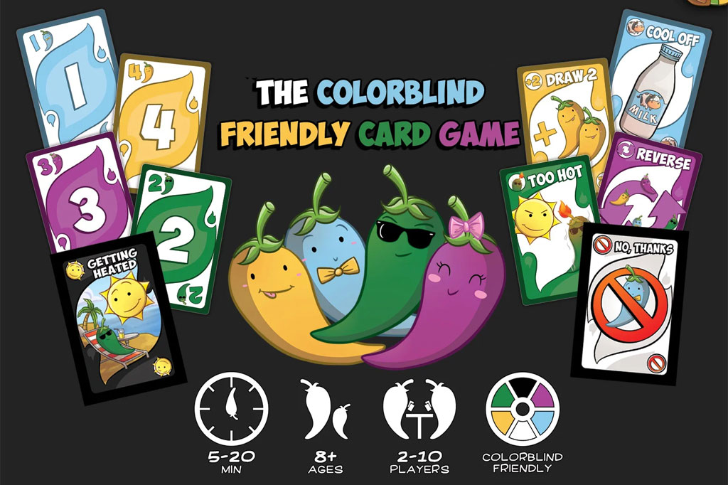
- Color + shape (hexagon vs. circle);
- Color + iconography (a star, sword, coin);
- Color + pattern (stripes, dots, hatching);
- Color + positioning (left vs. right, top vs. bottom).
Example: Instead of red/green tokens only, give the red token a triangle notch and the green token a circle inset. Or add a small symbol printed on each token.
Principle B — Favor High Contrast
Color differences that are subtle when viewed by people with normal vision may disappear entirely for CVD players.
- Ensure component contrast is high for both hue and brightness.
- Use clear borders and outlines so shapes remain distinct at a glance.
Principle C — Use Color Thoughtfully
Color is great for aesthetics and quick scanning. But for rules and critical state, never rely on it alone.
Principle D — Use Clear Labels
Player names, icons, and short action labels on cards or boards give unambiguous reference points. If you say “Blue takes action X,” also mark the blue player with a symbol, avatar, or name for reference.
Principle E — Offer Customization
Let players choose alternative color sets, reversible tiles, or sticker packs. If your components are modular, include an optional high-contrast/patterned version.
5. Practical Component Design Strategies
Player Pieces and Tokens
- Add unique silhouettes to each player’s color (e.g., pawns with different head shapes).
- Include icons or initials on tokens (e.g., “A”, “B”, “C”).
- Use texture (matte vs. glossy, ridged vs. smooth) where manufacturing allows.
Cards and Tiles
- Place type icons in the same corner on every card (e.g., resource, combat, event).
- Use border colors for quick scanning but include an icon/word for the underlying category.
- On multi-color cards, ensure important text is framed or boxed to separate it from colored art.
Boards and Maps
- Use patterns or hatching plus color to differentiate zones.
- Label regions with letters/numbers in addition to color fill.
- Use player names or pawn avatars to indicate control instead of relying on a colored “flag” only.
Dice and Counters
- If color distinguishes meaning, mark dice faces with numbers, arrows, or tiny icons.
- Avoid tiny color patches as the only distinguishing mark for counters.
Rulebook and Player Aids
- Use text labels (e.g., “red/attacker”, “green/defender”) and icons together.
- Include a color blindness note in the rulebook: explain alternate markers and how to swap them.
- Provide a player reference sheet with symbols and short text for actions, readable at the table.
6. Color Choices & Palettes

Some color pairings are commonly problematic (reds vs. greens). Prefer palettes that differ in both hue and luminance. Below are suggested pairings and ideas for alternatives — always pair color with another cue.
- Good pairings for critical differences: Blue vs. Orange; Purple vs. Yellow; Blue vs. Brown (when contrast is high).
- Avoid relying solely on: Red vs. Green; Blue vs. Purple; Brown vs. Green (without other cues).
Example accessible palette (use with symbol/text):
- Primary A: Deep Blue — #0B5FFF
- Primary B: Orange — #FF8A00
- Primary C: Teal — #00A99D
- Primary D: Purple — #7A33FF
Testing is more important than guessing — a palette that “looks fine” to you may fail for many players.
7. Playtesting
Recruit Diverse Testers
- Aim to include players with known CVD (ask politely when recruiting). Many players will self-identify.
- Use local gaming groups, online communities, and accessibility groups.
Test with Tasks, Not Opinions
Ask testers to perform common tasks that depend on color:
- “Sort these tokens by type.”
- “Identify which card is the Combat card.”
- “Who controls that region on the map?”
- “Which ability is active on your player board?”
Measure:
- Time taken to complete tasks.
- Error rates (misidentified pieces).
- Frustration and comments — qualitative feedback is gold.
Use Software Testing Tools
If you can’t access testers with CVD, use simulators (like Coblis — Color Blindness Simulator) to simulate different CVD types and find likely problems, then validate with real players.
8. Rulebook, Marketing, and Customer Support
- Rulebook clarity: Use labeled examples, not only color references.
- Marketing: Show images of the accessibility features in your campaign and product pages. This is attractive to inclusivity-minded buyers.
- Customer support: Offer free printable accessibility sheets or high-contrast player aids on your website.
- Honesty: If your game has components with unavoidable color issues, be transparent and explain available mitigations.
9. Design Examples & Alternative Mechanics
Here are concrete substitutions designers can adopt when color is commonly used:
- Color-based selection → Icon-based selection: Replace “choose the red card” with “choose the Sword icon card”.
- Hidden information by color → unique backs or markers: If secret roles are assigned by color, use role cards or labeled tokens instead.
- Team colors → avatars/names: Players pick character avatars or names in addition to color to help identification.
- Status lights → labeled tokens: Instead of colored LEDs or markers, add printed letters like “A” for active, “S” for stunned.
These small swaps preserve mechanics while improving clarity.
10. Common Pitfalls to Avoid
- Relying on color gradients to indicate value/strength (e.g., a gradient bar). Use numbers or icons as primary indicators.
- Tiny color indicators are only visible under ideal conditions — make icons larger, and contrast higher.
- Artwork that obscures icons — keep clear icon space or add a solid background chip behind icons.
- Assuming all cultures read color the same way — color semantics (e.g., red = bad) vary; rely on symbols and clear wording.
11. Checklist
Use this quick checklist during design reviews:
- Are all game-critical signals communicated by at least two channels (color + icon/shape/text)?
- Do tokens/cards/boards use high contrast and large icons?
- Are color pairings for critical distinctions chosen to be distinguishable by common CVD types?
- Are player colors supplemented with unique shapes or symbols?
- Does the rulebook avoid referring to color as the only identifier?
- Have you playtested with at least one player with CVD or used a simulator and then validated with human testers?
- Are marketing images and unboxing photos showing accessibility features?
- Have you prepared optional accessibility aids (player aids, stickers, alternative palettes)?
- Do component proofs and samples get viewed in grayscale or CVD simulations before final print?
- Is your customer support prepared to provide accessibility files if requested?


