Color is one of the most useful visual tools in board game design.
But when important game information depends entirely on color, some players may struggle to distinguish components or interpret the game state correctly.
This is particularly important for players with color vision deficiency, commonly referred to as color blindness. A player may have difficulty distinguishing red from green, blue from purple, or other similar colors depending on the type and degree of color vision deficiency.
For board game designers, color-blind accessibility should therefore be considered as part of the game’s visual information system—not as a last-minute adjustment before printing.
The goal is not to remove color from the game. The goal is to make sure that color is not the only way players can understand important information.
Here is how to design a board game that remains attractive, intuitive, and playable for players with different types of color vision.
Understand How Color Blindness Affects Board Games
Color blindness does not usually mean seeing the world entirely in black and white.
Instead, certain colors become difficult to distinguish from one another.
The most common forms involve red-green color perception, including:
- Protanopia/protanomaly: reduced ability to perceive red
- Deuteranopia/deuteranomaly: reduced ability to perceive green
- Tritanopia/tritanomaly: difficulty distinguishing some blue-yellow combinations
The exact experience varies considerably between individuals.
For a board game designer, however, the practical question is simpler:
If two colors become visually similar, can the player still understand the game?
Follow the Most Important Rule: Never Rely on Color Alone
A useful principle for accessible board game design is:
Color should reinforce information, not carry information by itself.
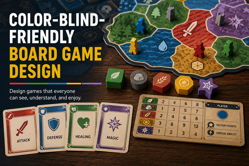
Suppose your game contains five resources:
| Resource | Color | Secondary Identifier |
|---|---|---|
| Wood | Green | Leaf symbol |
| Stone | Gray | Rock symbol |
| Food | Red | Wheat symbol |
| Gold | Yellow | Coin symbol |
| Magic | Purple | Star symbol |
Players who can easily distinguish the colors benefit from fast visual recognition. Players who cannot still have the symbols.
This is called redundant encoding: communicating the same information through more than one visual characteristic.
In board games, secondary identifiers can include:
- Icons
- Shapes
- Patterns
- Numbers
- Letters
- Borders
- Illustrations
- Component silhouettes
- Texture
The strongest designs often combine two or three of these systems.
1. Combine Colors With Unique Icons
Icons are one of the easiest ways to make a game more color-blind friendly.
Instead of identifying card categories only with colored borders, assign each category its own icon.
For example:
- Red cards → sword
- Green cards → leaf
- Blue cards → water drop
- Yellow cards → sun
Place these icons consistently on cards, player boards, tokens, reference sheets, and the rulebook.
2. Use Different Shapes for Important Components
Physical components provide another opportunity for redundant information.
Imagine a game with four resources represented by wooden pieces.
A less accessible approach might use:
- Red cube
- Green cube
- Blue cube
- Yellow cube
A more accessible system could use:
- Red cube
- Green cylinder
- Blue hexagonal prism
- Yellow disc
Now players can identify resources through both color and shape.
This can be particularly useful when components are frequently mixed together, such as resource tokens drawn from a bag or pieces stored in a common supply.
3. Add Patterns to Colored Areas
Patterns are especially effective when large areas of the board communicate information.
For example, territories belonging to different factions could use:
- Solid fill
- Diagonal stripes
- Dots
- Crosshatching
- Waves
- Grid patterns
Color can remain part of the visual design, but the pattern provides another method of identification.
This technique works particularly well for:
- Maps
- Player zones
- Faction areas
- Terrain types
- Card backgrounds
- Scoring regions
Be careful not to make patterns excessively detailed. A board filled with strong competing textures can become visually exhausting.
Patterns should support recognition without overwhelming the artwork.
4. Choose a Color Palette With Strong Differentiation
Redundant encoding is important, but choosing better colors still improves accessibility.
Avoid assuming that any four visually attractive colors will work well as four player colors. Some combinations are particularly easy to confuse.
Potentially problematic combinations include:
- Red and green
- Green and brown
- Blue and purple
- Light green and yellow
- Pink and gray
- Certain shades of orange and green
Instead, look for colors that differ not only in hue, but also in:
- Brightness
- Saturation
- Lightness
- Darkness
For example, two colors may technically belong to different hue families but still appear almost identical when their brightness levels are similar.
A palette containing dark blue, bright yellow, white, and deep red may be easier to differentiate than four medium-brightness colors.
5. Pay Attention to Contrast
Color blindness is not the only accessibility issue related to color.
Poor contrast can make information difficult to read for many players.
For example:
- Poor combination: Light yellow text on a white card.
- Better combination: Dark text on a light yellow background.
Contrast becomes especially important for:
- Numbers
- Card titles
- Resource costs
- Victory points
- Track spaces
- Player aids
- Rulebook diagrams
Important text should remain readable even when the color itself contributes little information.
A useful test is to temporarily view the component in grayscale. If important information disappears or becomes difficult to distinguish, the visual hierarchy may depend too heavily on color.
6. Design Player Colors Carefully
Player colors deserve special attention because they frequently appear across the entire game.
A player may have:
- Meeples
- Cubes
- Miniatures
- Bases
- Player boards
- Score markers
- Cards
- Territory markers
If everything relies on one color, confusion can spread throughout the entire experience.
One solution is to give every player both a color and a symbol.
For example:
| Player | Color | Symbol |
|---|---|---|
| Player 1 | Blue | Circle |
| Player 2 | Yellow | Triangle |
| Player 3 | Red | Square |
| Player 4 | Green | Star |
The symbols can appear on player boards, tokens, score tracks, cards, and reference materials.
This makes player identity consistent throughout the game.
7. Think About the Shape of Meeples, Miniatures, and Tokens
Different player pieces do not necessarily need completely different sculptures.
Small differences can sometimes provide enough additional information.
For example, player markers could use different:
- Base shapes
- Engraved symbols
- Silhouettes
- Printed icons
- Token outlines
If colored wooden meeples are otherwise identical, a printed or engraved symbol can provide an additional identifier.
For miniature-heavy games, differently shaped bases or base markings may provide another option.
8. Make Cards Readable Without Their Border Colors
Card games frequently use color to categorize cards.
For example:
- Red = attack
- Blue = defense
- Green = healing
- Purple = magic
Colored borders provide excellent visual organization, but they should not be the only identifier.
Consider adding:
- Category icons: Place a sword, shield, heart, or magic symbol in a consistent location.
- Card labels: Include words such as “Attack,” “Defense,” or “Magic” when space allows.
- Different frame treatments: Each category can use slightly different decorative borders.
- Illustration conventions: Different card categories can use recognizable visual themes.
A player should ideally be able to sort a deck correctly even if the cards are viewed in grayscale.
9. Avoid Tiny Color Indicators
Small colored dots are common in board game interfaces because they save space.
Unfortunately, they can also be difficult to distinguish.
For example:
“Gain 2 ● and spend 1 ●.”
If the two dots differ only in color, the information may become ambiguous.
Instead, combine color with symbols:
“Gain 2 [wood icon] and spend 1 [stone icon].”
The same principle applies to:
- Resource costs
- Card requirements
- Technology trees
- Character stats
- Scoring conditions
- Market prices
The more strategically important the information is, the less it should depend on a tiny color difference.
10. Be Careful With Colored Tracks and Charts
Tracks often become accessibility problems because designers use several colored lines in the same space.
Consider a board showing four economic indicators:
- Red line
- Green line
- Blue line
- Purple line
Where the lines cross, identifying them may become difficult.
Instead, use combinations such as:
- Solid line
- Dashed line
- Dotted line
- Double line
Each line can still have its own color, but its pattern provides additional information.
The same principle applies to graphs, technology trees, scoring paths, and campaign maps.
11. Don’t Forget the Rulebook
A color-blind-friendly board game can still become difficult to learn if the rulebook relies heavily on color.
For example:
“Move the green marker onto the red space.”
This instruction assumes that both colors can easily be identified.
A better version might say:
“Move the green leaf marker onto the red sword space.”
Rulebook diagrams should also use labels, icons, arrows, outlines, or numbered annotations where necessary.
Players should not have to infer rules from color differences alone.
12. Consider Accessibility During Prototype Development
Do not wait until the artwork is finished to think about color blindness.
Accessibility is much easier to incorporate during early prototyping.
Even a simple prototype can test:
- Player color combinations
- Resource icons
- Token shapes
- Card category symbols
- Map patterns
- Scoring tracks
Early accessibility testing can prevent expensive redesigns later.
For example, discovering that two player colors are difficult to distinguish before ordering custom wooden components is much easier to solve than discovering the problem after production.
13. Use Color-Blindness Simulation Tools
Digital color-blindness simulation tools can help designers identify potential problems before printing physical prototypes.
Many design and accessibility tools can simulate different forms of color vision deficiency.
Test important game screens and components under several simulations.
Look particularly at:
- Player colors
- Resource tokens
- Cards
- Maps
- Score tracks
- Dice
- Charts
- Reference sheets
Ask yourself:
Which pieces become difficult to distinguish?
Then determine whether another identifier—such as an icon, shape, number, or pattern—still makes the information clear.
Simulation is useful, but it should not completely replace testing with actual players.
14. Test in Grayscale
A simple accessibility test requires no specialized software.
Convert your board, cards, and player aids to grayscale.
Then ask:
- Can I still identify every player?
- Can I distinguish resource types?
- Can I understand card categories?
- Can I follow the scoring track?
- Can I interpret the map?
- Can I understand diagrams in the rulebook?
Not every decorative element needs to survive grayscale conversion.
The important question is whether gameplay information survives.
If removing color makes the game unplayable, the design probably depends too heavily on color.
15. Playtest With Color-Blind Players
Simulation can identify potential issues, but real players provide more valuable information.
Include color-blind players in accessibility playtesting whenever possible.
Instead of simply asking:
“Can you tell these colors apart?”
Observe the actual game.
Watch whether players:
- Pick up the wrong resource
- Confuse player pieces
- Misread card categories
- Ask repeatedly which territory belongs to whom
- Move the wrong marker
- Need to bring components unusually close to their eyes
- Depend on other players for color identification
These behaviors may reveal problems that a designer would otherwise overlook.
Ask players which alternative identifiers they naturally use. Their answers can help improve the entire visual system.